Designing an
onboarding
experience

The Problem statement
We are launching a new streaming product in Germany. We convert many users from classical TV and/or other predecessor apps. Other streaming products failed to address a proper onboarding into their service. We will address this gap by designing an onboarding process that users encounter upon starting the app for the first time. We cannot distinguish between users as at this stage in the experience, hence our experience aims both experienced and non-experienced users.
We evaluate success through activation and retention kpis. We also seek direct feedback continuously to the Joyn community
after launch.
Business Outcome
The business outcome was a bit difficult to pinpoint first, as we had little data to compare our new app to predecessors that provided a) poor experience and b) insufficient data.
We defined Activation and Retention related KPIs as in
-
% subsequent Streams after Signup (5 | 10 | 15 days)
-
% call-center contact declining after product launch
-
% Joyn community filed threads declining after product launch
Our Business impact was mostly measured in MAUs and #of consecutive streams.

Our users:
A problem of it's own as our initial MVP product could not distinguish between converters, seasoned streamers or casual users.
Yet we defined them to the best of our knowledge and redefining them later in the process through user testing.
A) The converters
Those who convert from classical TV or from predecessor apps (7TV & Maxdome).
(needs a clear instruction on how to use the app)
"I want to watch my beloved content on a different device than my tv. "
B) The seasoned
Those who stream on other platforms.
(does not need an instruction on how to use the app)
"I want to explore an alternative to existing platforms."
c) The casual
Those who browse by in the midst of the launch hype.
(unsure whether they need an instruction).
"I don't know if I want to watch on a streaming platform."
Our solution was simple:
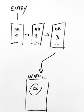
Design an onboarding experience as the first touchpoint a users sees (only once) when opening the app on mobile, tv and tablet.

Our hypotheses focused on all three types of Users to quickly build a prototype and test with users interviews.
We believe we will achieve subsequent streams, proof of user satisfaction and declining support requests in the first quarter of launch if PERSONA A/B/C can start using our platform through our onboarding experience
Our assumption aimed for user-centricity: Will our onboarding experience improve the CX for all customers?
We were afraid our solution might get in the way of the seasoned users as streaming platforms have become a thing. We prototyped fast in order to use our given slots in user-research to test our assumptions with users in our own lab.

We were focusing on simplicity in adding just the minimal required elements onto our prototype to see if users would be able to joyfully operate it.

We assumed "swiping" was a learned behavior and through our dot-navigation indicator we would not need additional navigation elements.
How wrong we were...it turned out quickly that test-users were confused and frustrated with our hypothesis. So we added a button to connect each layer as a second navigation element.

While this solved our issues with confusing test-users with how to navigate through the experience; we still experienced frustration on the seasoned users as their goal was to experience the content fast.
Hence we added a shortcut. This version was good enough for us to build into our MVP product launch in May 2018.

Refinement/Visual Design
In order to mimic both our brand and product behavior, we combined visual and behavioral of our product as a system approach to swap out content based on actuality (and later on, user behavior).

A) Background
We used footage of subtle movement of content on our platform. User tests revealed moving images in the background felt more immersive than statics. Hence we researched the best suitable footage for actual content on our platform that would encompass our criteria of vibrant colors, subtle movement and representation of our content.
B) Gradient
To adopt our coherent communication, brand and product pattern, we picked the the most predominant color our the footage and layed a color gradient on top of the experience. Initially we handpicked the color, later on we defined a feature to have our system pick the color automatically.
C) Design
To adopt our coherent communication, brand and product pattern, we picked the the most predominant color our the footage and layed a color gradient on top of the experience. Initially we handpicked the color, later on we defined a feature to have our system pick the color automatically.
Our design approach was driven by simplicity; hence our solution was easily applicable to all platforms.


Our approach altered over time through user-testing and the maturity of our platform.
We met our kpis in regards to activation and retention, but could not met our business outcome of MAUs as we expected.
A test with skipping the onboarding experience to 50% of people resulted in high(er) support requests. To this day, the Joyn experience still greets you with our onboarding experience upon opening the app on the first time.